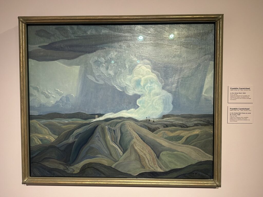
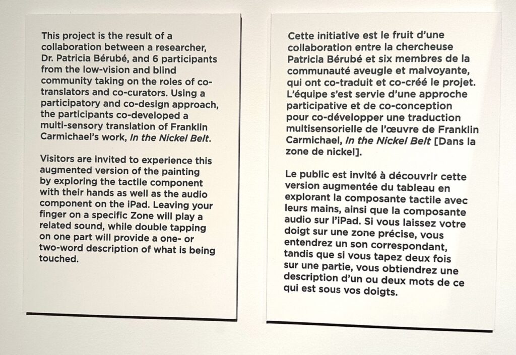
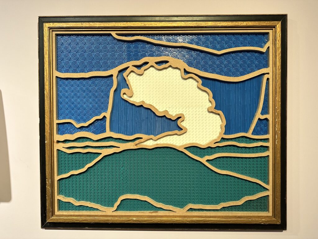
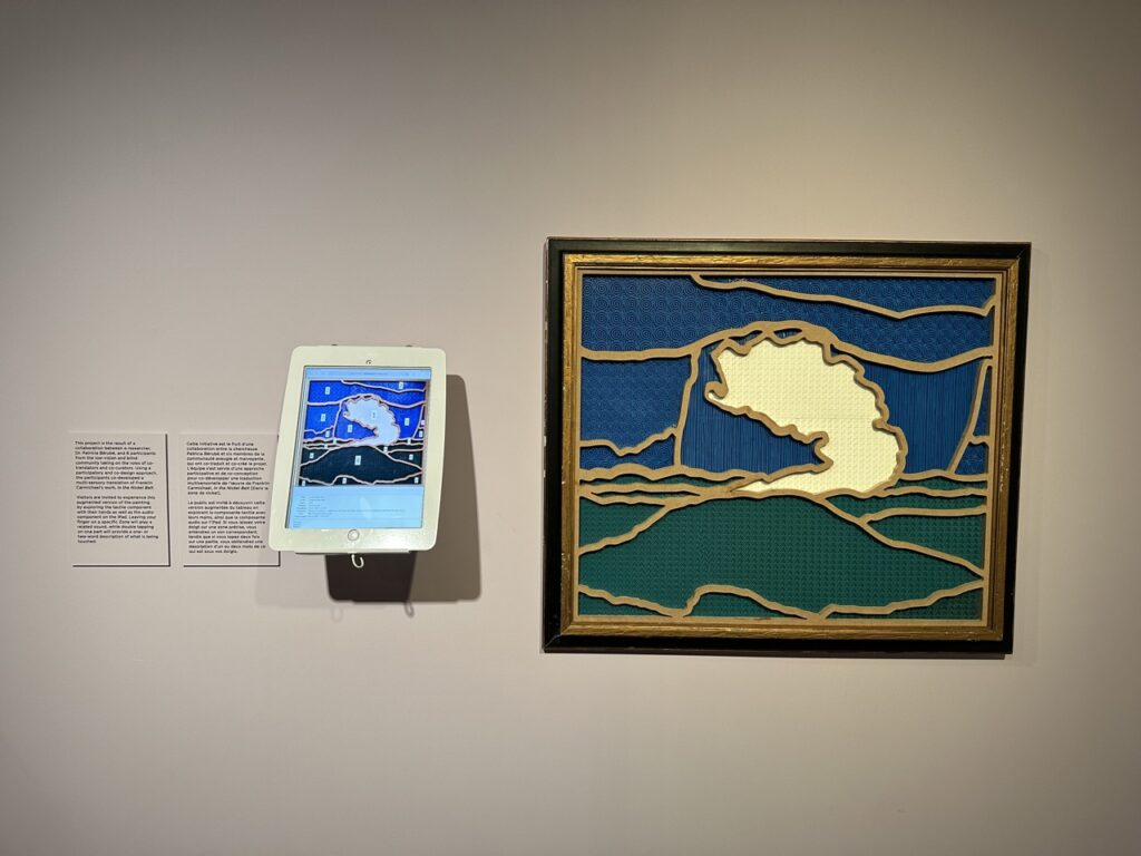
This is the 2nd tactile art piece we’ve seen at the Ottawa Art Gallery (OAG) (see April 8 2020 for the previous piece we experienced there). Unlike the previous, this research project is based on an original artwork – Group of Seven member, Franklin Carmichael’s 1928 “In the Nickel Belt” oil painting. This work is interpretively reproduced as a rubber and wood tactile image with an adjacent iPad surfacing descriptions and sound effects. There is a substantial disconnect between navigating the iPad and the tactile image, going back and forth, which would certainly be a barrier to autonomous exploration for blind users, and the iPad was not set to access mode, meaning sight was required for on-screen orientation and navigation. Yet the interesting point for us with this work, is the dividing up of the paintings various landscape elements, the tactile patterning, and material selections and uses. We’d have more than a few notes for consideration within this experiment to render it more inclusively accessible, but we love that the OAG keeps on exploring various ways of making 2D artwork accessible to a wider audience.
Tag: surfacing
Tactile QR Code: Bourbon Edition
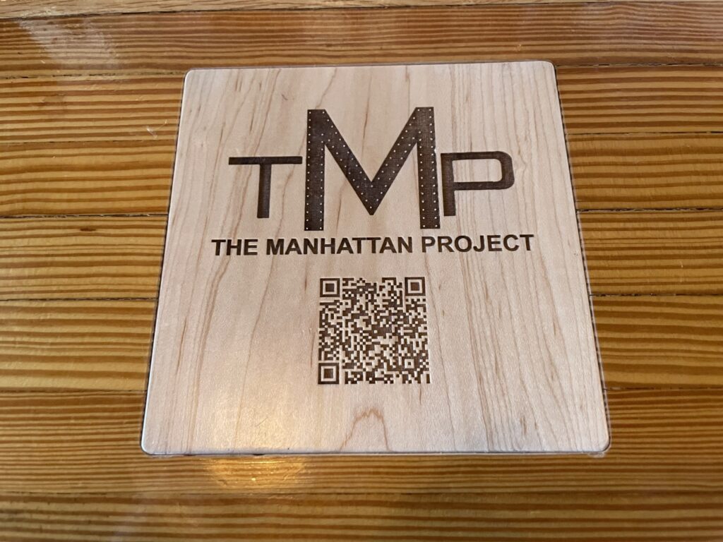
We have been using QR codes in some of our work as a simple way of surfacing access affordances, like visual descriptions of artwork within exhibition and gallery spaces. The final hurdle always remains ensuring the QR code is discernible through multiple modalities – not just visual. Making QR codes tactile is one of the tactics that can help contribute to their findability and usability (lining up the camera with the code). In many cases it has meant printing them with thermoform, 3D printing them, adding stickers to the printed codes, applying the printed code to a container or surface that is tactile, and various other methods. In this case, at The Manhattan Project in Louisville, Kentucky, they were so pleased with using QR codes for their menus during the pandemic, they embedded laser etched versions into their bar top. The bar manager was very happy to discuss the fabrication techniques with us. They were even more pleased to learn that in surfacing their menu in this way (digital on mobile via QR) they have made their menu accessible to many people who would otherwise have faced an access barrier. Digital presented on mobile allows for screen reading, pinching and zooming, color swapping, and more. The high contrast between fore and background helps visual discernibility, and the square itself is tactily distinguishable from the counter.